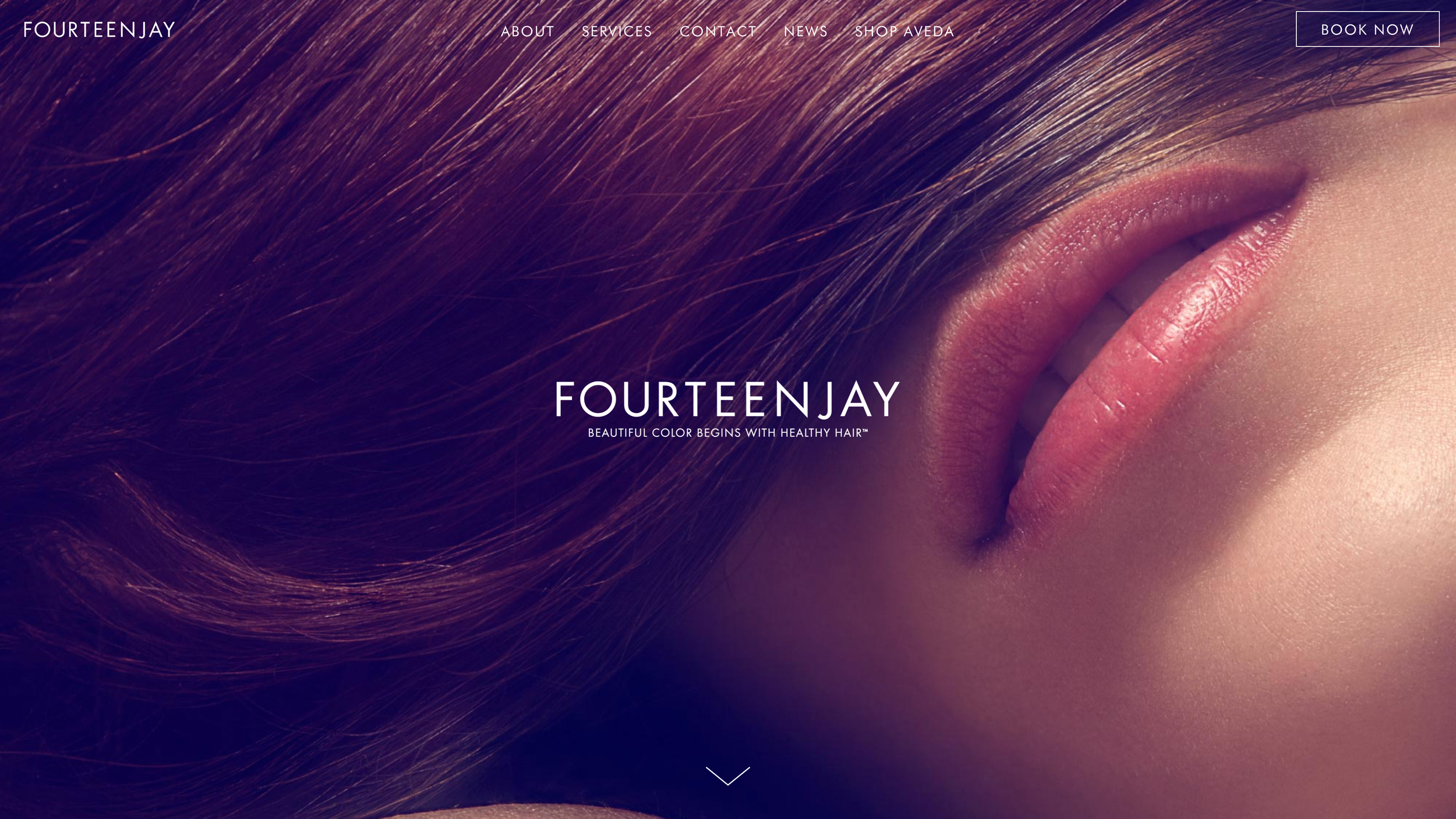
Fourteenjay is a high end, luxury hair salon in Manhattan, New York. Their mission is to provide their clientele with elevated, high-touch service.
The Problem
Fourteenjay is luxury boutique salon located in the TriBeCa neighborhood in Manhattan, New York. The salon focuses on consistently executing elevated, luxury high-touch service to their clientele, but their existing website falls short of properly representing the experience their clients are accustomed to while in the salon. Because their website is typically one of the first interactions their clients have with the salon, it is important that its design conveys a cohesive aesthetic that properly represents the brand. My goal was to re-design their site and create a more updated, seamless experience for their clients.


The Solution
User Research
I began my ideation process by asking eight women who represent Fourteenjay’s target clientele to walk through the website as if they were researching a new salon and then had them answer a questionnaire. When asked to give a one word description of the website, the most commonly used words were “outdated” and “clunky”. The majority of the users felt frustrated by the lack of information and pictures, and when asked about branding they felt that there wasn’t a clear one. The users were also asked the most important qualities they look for when searching for a new salon and the words most frequently used were “experience”, “reputation”, and “quality”. Some additional recommendations made by three of the users tested was to add the salon’s reviews to the site as well.
User Research Takeaways
Following user research I made a list of the components on the existing site that needed to change:
Update the general aesthetic to better represent a trendy, high-end hair salon
Create consist branding throughout the site
Accurately convey the salon’s experience and quality
Update the site's information architecture
Present pricing in a more transparent manner
Add more information on the service providers
Present examples of the salon’s work through images and social media
Add a section to showcase client’s reviews of the salon
User Flow
Wireframes/Sketches
High Fidelity Prototype
Design Decisions
Keeping the salon in mind I selected a color palette that better represents the Fourteenjay brand. The salon is very neutral, with pops of color, specifically pops of red, which is repeated throughout the interior of the salon. For the typeface I went with Dunbar Text to bring in some modernity and consistency to the site. This also allowed me the use of upper and lower case text — the original site was lacking that contrast on multiple pages making it difficult to read.
Takeaways
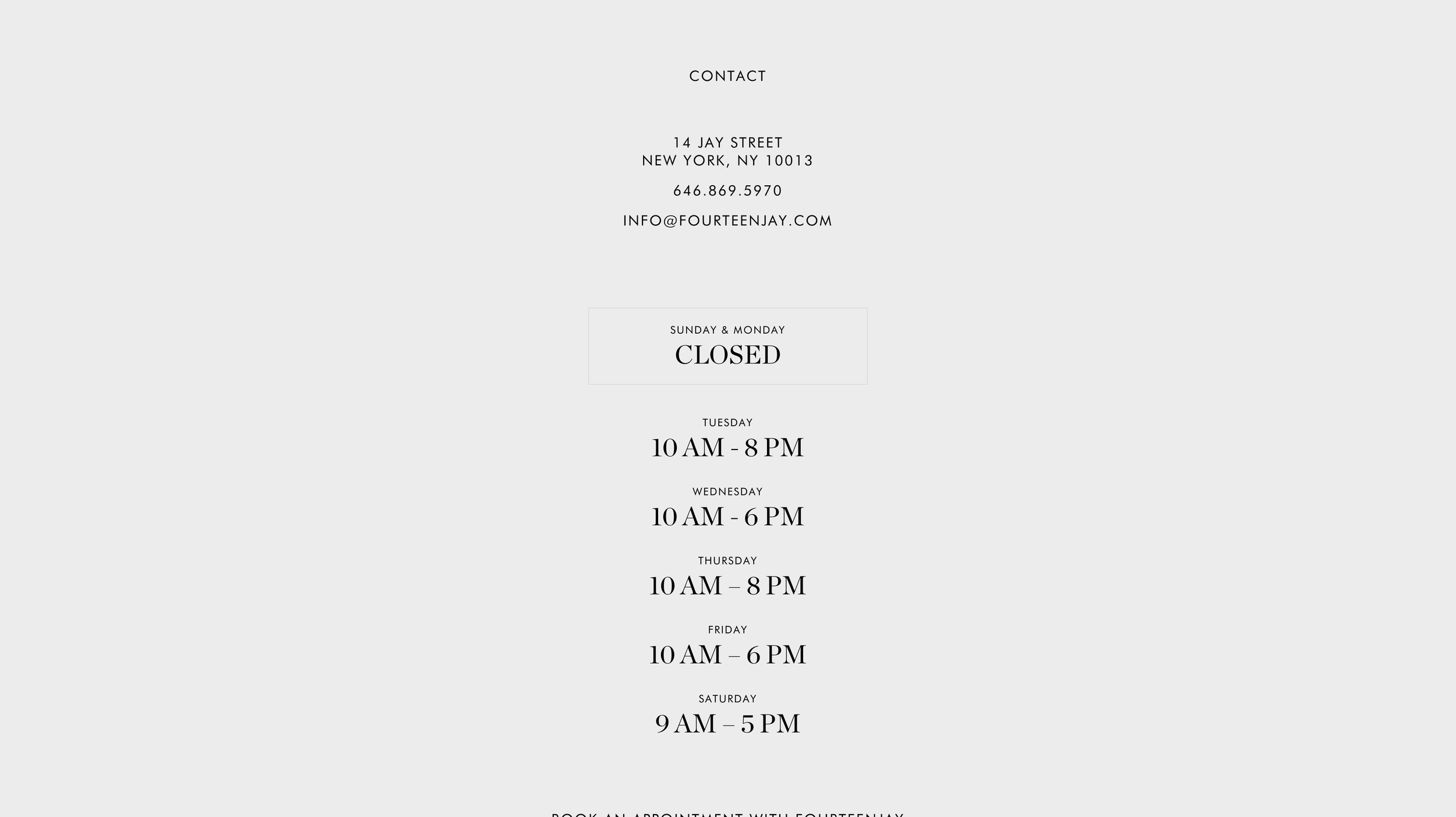
By focusing on my user research and implementing what they desired from a high end salon’s website, I was able to create a product that better serves as the first point of contact for the Fourteenjay clientele. The branding is more consistent throughout the site, and the user is able to quickly and easily locate the information they desire in order to book an appointment, or just simply find out more information on the salon. I removed any conflicting information and refined the content, updated the pricing list, and added links to Fourteenjay’s social media accounts. I also created a press page to showcase the service providers work, and added biographies for each team member, in order to give the salon more credibility with new clients.


